Flyers
Flyers: Center Ice Logos a Sign of Rebuilding More than Just Roster
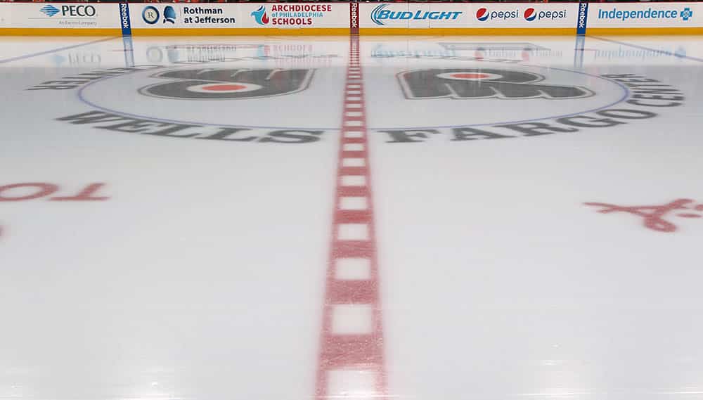
In announcing a rebuild, the focus obviously falls heavily on the product on the ice – the players that are tasked with being competitive night in and night out to achieve success. That success is multiple seasons away, but the shift in direction to building the right way is underway.
But in the current state of the Flyers, there is more to be rebuilt than the roster. The previous ownership representation of Dave Scott was responsible for breaking the culture that was established by Ed Snider and maintained meticulously for decades.
In the months since wholesale changes – Scott retiring, Dan Hilferty coming in as the new representation of Comcast, GM Chuck Fletcher being fired, and the hiring of Keith Jones as President of Hockey Operations and Danny Briere as GM -– the new regime has shown signs of returning to its roots.
The extravagant press conference for the “New Era of Orange.” The burnt orange jerseys. Taking a swing on a highly-touted prospect in the draft.
And then there was this video that the team released on Wednesday evening:
Resurfacing tradition. pic.twitter.com/VRHRW5xr4C
— Philadelphia Flyers (@NHLFlyers) September 13, 2023
The Significance of the Double Logo
Laying down the ice for a new season and releasing a video for it is not unique. Teams from across all levels of hockey have been doing it for years. It’s the design at center ice that should command your attention.
The double logo is returning. The Flyers are the lone team in the NHL to use this design. They made the switch to a single logo across center ice for the 2019-20 season.
The reason for the return of this runs far deeper than just going back to a traditional look. It’s a change that honors Snider’s legacy.
Snider loved the logo to be on both sides of the center ice line. It allowed all fans in the area to easily see it and it kept the logo untouched. As many teams moved to a single logo at center ice, the red line divides the logo.
When the Flyers made this change for the 2019-20 season, it was met with mixed reviews primarily due to Snider’s belief on such a decision.
Rebuilding the Fan Base
Bringing this traditional look back is a nod to the fans that there is commitment to a rebuild at every level. Sure, rebuilding the team on the ice is a commitment that requires several seasons. At the very least, the brass behind the operation can show they are hearing the fan base and their desires to carry on the traditions of the past.
Those are more immediate changes that can be made. These are the steps you take to start repairing the fractured relationship between the franchise and the fan base that can help grow the patience it will take to get the team back to contending again.
It may not seem like much, but for a franchise that seemingly lost its way, lost its identity, it’s starting to gain it back with recognizable decisions like this.


