Beginning in 2021, Major League Baseball and uniform partner Nike have collaborated with most clubs to create unique alternate uniforms. Dubbed by MLB and Nike as “City Connect” uniforms, the alternate uniforms are designed to connect the club with the fans and the city or region they call home. Some are good and some are, well, not.
From worst to first, here’s a ranking of Major League Baseball’s City Connect uniforms!
MLB City Connect Uniform Rankings
Detroit Tigers
The Detroit Tigers are wearing their new Motor City #CityConnect uniforms for the first time tonight. Do these look better in action? Has your opinion changed since the unveil?
🐯🚘⚾ #Tigers #MLBThe story behind these uniforms: https://t.co/OiYG7ioGIW pic.twitter.com/5CedpR4KGk
— SportsLogos.Net (@sportslogosnet) May 10, 2024
Oof, nothing says baseball like tire tracks on the chest! It’s not a surprise that Detroit chose to honor the city’s automotive history but the way they chose to do it is questionable at best. Like a handful of other teams, the Tigers’ City Connect uniform is void of the city’s name on the jersey. Instead of a “Detroit” or “Tigers” wordmark the uniform features “Motor City,” Detroit’s nickname. Meh, it’s a cop out. There are other hints at Detroit’s automotive history such as numbers rendered to look like vehicle identification numbers. Detroit’s traditional Olde English “D” is only found on a sleeve patch and the only tiger imagery is on the underbill of the cap.
Grade: D
Los Angeles Dodgers
In what may be my favourite part of this new look, the #Dodgers will be wearing Dodger Blue pants to match the #CityConnect jerseys and caps. Honestly I’m amazed how quickly I’ve embraced this new coloured pants trend in baseball.
More pics/details here: https://t.co/EMvp3Ru73q pic.twitter.com/eThIs65kXk
— SportsLogos.Net (@sportslogosnet) August 19, 2021
The Dodgers’ initial City Connect uniform is the epitome of laziness! “Los Dodgers,” that’s it? The original idea of the City Connect uniform was to connect with “Fernandomania” that took over LA in the 1980’s which makes sense but there was little effort put into the uniform. Originally paired with blue pants, the uniform has changed to look like the Dodgers’ Spring Training get up.
LA will be unveiling another City Connect uniform later in 2024. Maybe this one will evoke more of Hollywood or harken back to the Dodgers’ Brooklyn roots.
Grade: D
Philadelphia Phillies
An ode to Philly’s past, present & future.
➡️ https://t.co/5ZsDu5BBDu pic.twitter.com/RGnXRnl3zC
— Philadelphia Phillies (@Phillies) April 5, 2024
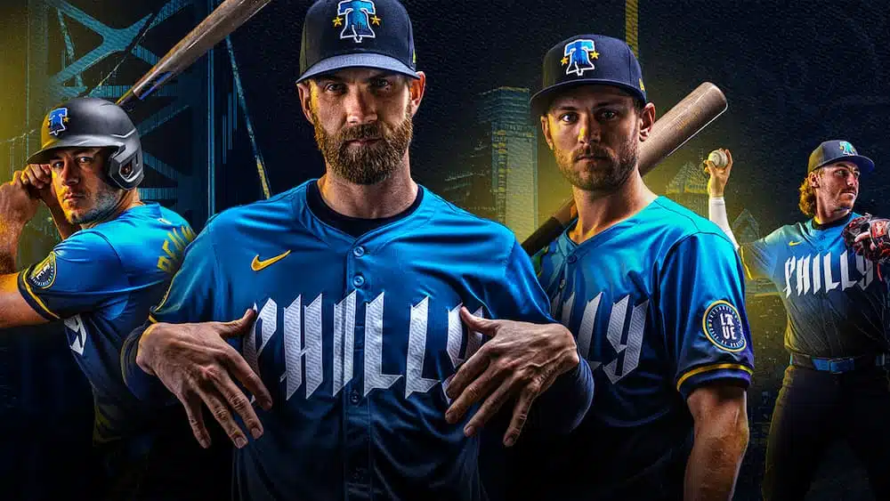
The Fightins’ City Connect uniform draws inspiration from the Declaration of Independence, Love Park, local vernacular, and the flag of the City of Philadelphia. Okay. But for a city that’s passion is its sports teams, MLB and Nike could’ve come up with something a bit more geared towards that spectrum of the city (pun intended). How about incorporating all the colors of the city’s sports teams similar to the Philadelphia Seventy-Sixers’ 2021-22 “City Edition” uniform?!. By the way, those Sixers’ unis were perfect.
Hell, as Philadelphia sports fans know, the blue and yellow just doesn’t work! Not to mention, the Boston Red Sox have already co-opted the look!
The uniform also features wonky numbering that makes certain players’ numbers –lookin’ at you Trea Turner!– look more like a punctuation mark than a numeral! At least the cap is cool. That’s something the Phillies should consider putting in their regular rotation in normal team colors.
Grade: D
New York Mets
🚨 THE METS’ CITY CONNECT JERSEYS ARE HERE 🚨
Read the full story on their design and their New York City roots from @martinonyc: https://t.co/A3yJ1MlQrf
📸: @Mets pic.twitter.com/rwX2VZu9D3
— SNY Mets (@SNY_Mets) April 19, 2024
MLB and Nike decided to go with a purple and gray theme for the Metropolitans evoking New York City’s skyscrapers, bridges, and the No. 7 train that runs near Citi Field. A team born out of the color identities of the New York Baseball Giants and Brooklyn Dodgers instead looks like a cheap version of the New York University Violets athletic teams.
The Queensboro bridge on the hat and helmet is just awful and doesn’t mesh well at all. It looks out of place. For a project that was in development for two-years, the Mets could’ve come up with something that connected a bit better with their fans and overall identity. It almost feels like the Mets were forced to appease all of New York because the New York Yankees have chosen not to have a City Connect uniform.
On a positive note, the lettering is sharp and gives a nod to the Mets’ past.
Grade: D
Cincinnati Reds
The Cincinnati Reds revealed their City Connect uniforms 🔥
📷: @Reds pic.twitter.com/fVEmklSmUN
— FOX Sports: MLB (@MLBONFOX) May 13, 2023
Nothing says history and tradition like black uniforms with a modern font and futuristic logo!
That’s exactly what the Reds’ City Connect uniform entails. So much for being the “birthplace of professional baseball!” Perhaps, you know, something along the lines of the “Big Red Machine” would’ve worked better?!
Additionally, the Reds’ uniforms are nearly unreadable. The names and numbering are either red or red with an odd white outline that is barely visible on TV and likely not visible from the stands.
Grade: D
Texas Rangers
From deep in the heart of Texas. 😮💨
Want to win a @Rangers City Connect jersey? RT and comment why for a chance to win! pic.twitter.com/yJds1RbmBW
— MLB (@MLB) April 22, 2023
The Rangers’ City Connect uniform leaves a lot to be desired and, like the Cincinnati Reds, isn’t visually appealing. It’s hard to tell what exactly you’re looking at. The Rangers’ City Connect logo is a gothic mesh that’s supposed to be a “TX” with a spur but looks more like a jumbled mess. The shame of the Rangers’ design is they have a cool representation of the old Dallas-Fort Worth Spurs logo on the pants. Using this logo as the basis for the whole design could’ve been a game changer!
Grade: D
Chicago White Sox
These Chicago White Sox City Connect uniforms 🔥
(via @MLB, @nikediamond) pic.twitter.com/c4i2nbKoxY
— Yahoo Sports MLB (@MLByahoosports) May 28, 2021
Well, at least they’re the current team colors. The White Sox City Connect isn’t awful but it’s not exactly great. The team has a unique uniform history that could’ve been tapped into a bit more if Nike was so hellbent on creating “unique” designs. There’s a handful of fans that believe the ChiSox red and white is their best look. The Sox “Southside” Gothic font is comical and would’ve been better rendered in the Sox traditional logo.
Grade: C
San Francisco Giants
San Francisco Giants are the newest team to show off a Nike City Connect uniform!
How you guys feeling about these? pic.twitter.com/677Q0DqJvm
— Talkin’ Baseball (@TalkinBaseball_) July 5, 2021
Like the Chicago White Sox, at least the San Francisco Giants rendered their City Connect uniform in their traditional colors. Well, sort of. The Giants’ City Connect uniform is rendered in orange and gray which turns into a gradient to white. The uniforms are designed to evoke the fog that envelopes the city’s famed Golden Gate Bridge and surrounding areas. What you get is a uniform that is hard to read from a distance. The Golden Gate Bridge sleeves don’t do enough to make up for the plain nature of the uniform. The orange cap is okay, though!
Grade: C
Chicago Cubs
For the ivy. For Wrigleyville. For #All77 of Chicago’s neighborhoods.
These are the @Cubs’ Nike City Connect uniforms. pic.twitter.com/8kkZ2pEDe6
— MLB (@MLB) June 8, 2021
Wash, rinse, repeat! The Chicago Cubs’ City Connect uniforms made an attempt to evoke the City of Chicago flag but didn’t go far enough in doing so. The Navy blue uniforms trimmed in light blue and white come off as plain and boring. It almost feels like the Cubs’ didn’t want to go with too drastic of a design and instead ended up with what they’ve got. The “Wrigleyville” wordmark on the front –rendered in a font similar to the famed Wrigley Field marquee– is a nice touch but not enough to save the overall look and feel of the uniform.
Grade: C
Arizona Diamondbacks
Just dropped 🐍:
Nike City Connect x Arizona Diamondbacks
📸: MLB pic.twitter.com/Vanj3jMrec
— Front Office Sports (@FOS) June 13, 2021
Boring! That’s what the Arizona Diamondbacks’ City Connect uniforms are! Born in the 1990’s, the Snakes could’ve gone back to the team’s roots and chosen a combination of purple, teal, copper, and black. Instead, the D-backs chose a “gold” color to evoke the Sonoran Desert that they call home. The “Serpientes” wordmark was chosen as a tip of the cap to Arizona’s Hispanic heritage. The D-backs’ choice to go Plain Jane was a big-time miss!
Grade: C
Kansas City Royals
The Kansas City Royals revealed their Nike City Connect uniforms 👑
📷: @Royals pic.twitter.com/i57eDA7HnC
— FOX Sports: MLB (@MLBONFOX) April 25, 2022
So close, yet so far! The Kansas City Royals’ City Connect uniforms are almost solid. Almost! Rendered in Navy blue with light blue and white trim, the uniforms are designed to pay homage to past Kansas City baseball teams notably the Negro League’s Monarchs and Athletics. The Royals’ famous interlocking “KC” is rendered in an art deco style meant to evoke city architecture and the famed Kauffman Stadium fountains. All of the elements seem to work but the uniform just comes off as bland. Perhaps, Kansas City could’ve taken a page from their 2016 team that honored the 2015 World Series Championship club and added some gold elements to their City Connect uniform.
Grade: C
The next few entries in the MLB City Connect uniform rankings all have something in common. They came very close to mimicking some of the great uniforms in each club’s history but –let me know if you’ve heard this before– just missed the mark.
Seattle Mariners
Seattle Mariners City Connect uniforms. 👎👍? pic.twitter.com/f1SNB2s0yX
— FB_Helmet_Guy (@FB_Helmet_Guy) April 28, 2023
The Seattle Mariners City Connect uniform is almost a straight throwback to the 1969 Seattle Pilots with an element of mid-to-late-1980’s Mariners thrown in the mix. The M’s City Connect uniform uses the Pilots’ “Seattle” wordmark and jersey stripes along with a “PNW” patch that closely resembles the Pilots’ logo. For good measure, the M’s used the popular trident logo on the cap. It was Nike’s color choices for this uniform –Royal blue, gold, and black– that turned a potential great uniform into a so-so uniform. In fact, it’s the black pants that throw off the uniform set. Perhaps switching to white pants can save this set!
Grade: C+
Milwaukee Brewers
The Milwaukee Brewers have revealed their new City Connect uniforms 🌾🔥 pic.twitter.com/Oq1b9Orm4C
— BarnBurner Sports (@BB__Sports) June 17, 2022
Some teams can rock the light blue uniforms and the Milwaukee Brewers are one of those teams. It was a pleasant surprise to see the Brew Crew use light blue –apparently a nod to Wisconsin summer skies– as their main color of choice for their City Connect uniform. Even the “Brew Crew” wordmark with its unique font on the front of the jersey works. What’s missing is the famous “ball and glove” logo which is a huge element to the Brew Crew’s identity. The logo is replaced with “MKE” the abbreviation for Milwaukee’s Mitchell International Airport and a baseball like grill patch on the sleeve. No ball and glove, no Bernie Brewer, no beer…definitely a missed opportunity!
Grade: C+
Houston Astros
The new #Astros uniforms feature “SPACE CITY” across the chest, a new spin at their classic “H-Star” cap logo, and socks full of Tequila Sunrise #MLB #SpaceCity
Learn more about their new 2022 #Nike #CityConnect set here: https://t.co/Z5hWbo21Ff pic.twitter.com/Vi41QI8d1O
— SportsLogos.Net (@sportslogosnet) April 10, 2022
Come on, Houston! Go all-in on the tequila sunrise uniforms! This was the only correct way to render the Houston Astros’ City Connect uniform and the club just dabbled in it. There are elements in the piping, numbers, and cap logo that harken back to one of the greatest uniforms in all of professional sports, but it’s just a tease! Fine, put the “Space City” moniker on the uniform but give the Astros’ their proper digs! Even in all Navy blue! Sigh, what could’ve been!
Grade: C+
As we get further along, we’re reaching the “yeah, this is different but works” phase of the City Connect uniform rankings. The next handful of City Connect uniforms should not necessarily work but they’re damn good!
Los Angeles Angels
Here’s a look at the Los Angeles Angels Nike City Connect uniforms. What do you guys think? pic.twitter.com/w445VSSqFK
— Talkin’ Baseball (@TalkinBaseball_) May 28, 2022
The Halos’ City Connect uniform is Plain Jane and similar to their past uniforms…and that’s exactly why it works so well. Sometimes less is more and Los Angeles proved it with their City Connect uniform design. The cream colored uniform pays homage to the beach but it also makes the uniform feel like a classic throwback. The “Angels” wordmark script, the use of the halo “A”, and the “surfboard” stripes make this uniform work,
Grade: B
San Diego Padres
The Padres unveil their colorful City Connect unis, which pay tribute to both San Diego and Baja California 🔥
Where do these rank?
📸 @Padres pic.twitter.com/ARvUmGQen9
— The Athletic MLB (@TheAthleticMLB) July 1, 2022
Thank God the San Diego Padres went in another direction with their City Connect uniforms! It could’ve been a really crappy (sorry!) situation of the Padres’ City Connect uniforms featured their traditional brown and yellow. Paying homage to the California coast and close proximity to Baja California, the Friars uniforms are a colorful explosion of awesomeness. The pink, mint green, and yellow shouldn’t work but they’re absolutely fantastic.
Grade: B+
Tampa Bay Rays
The Tampa Bay Rays revealed their City Connect uniforms 😎
📷: @RaysBaseball pic.twitter.com/CHF4T0BeBb
— FOX Sports: MLB (@MLBONFOX) April 29, 2024
Tampa Bay’s City Connect uniforms are exactly what Arizona’s should’ve been, a nod to their 1990’s birth with bright and bold colors. Called “Grit X Glow,” the Rays’ City Connect uniforms take many elements of their original Devil Rays uniforms and put them on full display albeit with a modern twist. The use of the bright purple, blue, green, and yellow screams Tampa Bay! Well done, Tampa!
Grade: B+
Baltimore Orioles
The Baltimore Orioles unveiled their City Connect uniforms 🔥
📷: @Orioles pic.twitter.com/I3KRBLOTIF
— Sporting News MLB (@sn_mlb) May 22, 2023
Plain, simple, effective are the three words that describe the Baltimore Orioles’ City Connect uniforms. The O’s choice to originally go with a monochromatic black uniform, simple typeface, and a simple blast of color was the definition of “keep it simple, stupid” but in a positive way. The slight pop of color represents the neighborhoods and institutions of Baltimore such as the NFL’s Baltimore Ravens. The choice to move to white pants in 2024 is slightly disappointing but that could be more to do with Nike than the O’s.
Grade: B+
As we get to the top of the City Connect uniform rankings, the next set of teams clearly understood the assignment and passed the test with flying colors. The next six MLB clubs are exactly what the City Connect program should be about. Each club’s City Connect uniform is identifiable with their respective city and/or region or the history of baseball in their city.
Miami Marlins
OTTO! pic.twitter.com/KPAj0CixcK
— Miami Marlins (@Marlins) May 11, 2024
Many fans groaned with disappointment when it was revealed the Miami Marlins’ City Connect uniforms wouldn’t feature the Fish’s iconic teal and black. But boy, did the Fish crush it with their choice. Using Miami’s Cuban heritage as inspiration, the Marlins chose to honor the Cuban Sugar Kings —baseball’s first non-United States club— with their City Connect uniforms. The Fish used the Sugar Kings’ bright red and combined it with “Miami blue” to create a masterpiece. The uniform is bright, bold, and screams South Florida. In fact, the Fish’s City Connect uniform is leaps and bound better than their everyday uniforms. Like, not even close.
Grade: A
Washington Nationals
The Washington Nationals have debuted their Cherry Blossom City Connect uniforms.
Are they 🔥 or 😐?
Tell us what you think.
(via @Nationals) pic.twitter.com/rJKFW6RkqA
— Pickswise (@Pickswise) April 9, 2022
The Washington Nationals’ City Connect uniform perfectly encapsulates a city that is more known for its politics than anything else. The choice by ownership to embrace the city’s cherry blossoms has proven to be a home run. The gray uniforms with pink trim are a thing of beauty and are immediately recognizable as being the Nats’ uniforms. The uniforms proved so popular that they were mimicked by the NBA’s Washington Wizards. Unfortunately all great things must come to an end, the Nats will retire the Cherry Blossom City Connect uniforms at the end of the 2024 MLB season.
Grade: A
Pittsburgh Pirates
Welcome back, Nick! pic.twitter.com/l65ofVujHC
— Pittsburgh Pirates (@Pirates) May 10, 2024
Did you really think a team from Pittsburgh was going to wear something other than black and yellow? The Pittsburgh Pirates City Connect uniform pays homage to the city’s bridges and industrial past. The Buccos’ City Connect uniform is also based on the awesome “We Are Family” era of Pittsburgh Pirates baseball and the unique uniforms that went with it. The large “PGH” wordmark shouldn’t work but it hits a homerun. The only negative to the Pirates City Connect uniform would be the lack of noticeable “Stargell Stars” that should’ve been included somewhere.
Grade: A
Boston Red Sox
The Boston Red Sox City Connect uniforms are back. pic.twitter.com/VuEG0iiUSZ
— Boston Strong (@BostonStrong_34) April 14, 2023
The thought of the Boston Red Sox wearing colors other than Navy blue and red seemed almost sacrilegious. But Boston’s decision to go with a Patriots’ Day uniform rendered in Boston Marathon yellow and blue was a fantastic choice for the Red Sox City Connect uniform. The colors are also a symbol of resilience in the wake of the Boston Marathon bombing of 2013. For a city that is uniquely tied to its sports teams —particularly the Boston Red Sox— the choice of yellow and blue works so well.
Grade: A+
Atlanta Braves
The Braves City Connect unis are fantastic. Glorious uniform matchup down in Atlanta. pic.twitter.com/zHFs9XHlGR
— NFL Fashion Advice (@fashion_nfl) July 16, 2023
The Braves’ City Connect uniform design doesn’t honor the city of Atlanta but rather one of the greatest baseball players to ever live, “Home Run King” Henry Aaron. And that’s absolutely fine. The Braves’ City Connect is based on Aaron’s uniform when he hit his record breaking 715th homer on April 8, 1974. The notable difference is the Braves’ City Connect uniform lacks the “Braves” wordmark but rather has their current “A” logo with the word “the” printed over top to reference the city as “The A.” This look is so good that Atlanta should consider using it as their primary look.
Grade: A+
Colorado Rockies
Thoughts on these new Colorado Rockies City Connect jerseys? 👀
📸: @Rockies pic.twitter.com/cyuskpGaG6
— FanDuel Sportsbook (@FDSportsbook) May 27, 2022
The Colorado Rockies have worn black and purple since their inception in 1993 so anything other than those colors was going to be a departure from the norm. The Rox, in a tip of the cap to their surroundings, choose green and white with purple trim. The uniform simply hits a home run. It’s a fantastic representation of the natural beauty of Colorado while still tying in the Rox long history with purple. It’s a beautiful look, the best of the City Connect series.
Grade: A+
